A nalyses of the journal Oppossitions today relates to the seminal texts that were published in it or the constant affirming and reaffirming of the different intentions, viewpoints and architectural, theoretical, critical, social and political opinions and backgrounds of the authors and editors involved in the magazine. By shifting the focus from these subject to the structure and design of the magazine, as well as their relation to that specific time period in American architectural history, I will try to establish how this related to Oppositions becoming a successful disseminator of architectural knowledge and how it stayed relevant even today, thirty years after its last issue was published.
“Oppositions constituted a unique appearance on the American architectural publishing scene in these years, its provenance being neither academic nor professional, and its orientation being strongly European”.
Joan Ockman. “Resurrecting the Avant-Garde: The History and Program of Oppositions”. EAV – Ensignement architecture ville 10. Versailles. Ecole d’architecture Versailles, 2004/2005. 31-44
FORMING AND INFLUENCES OF THE OPPOSITIONS JOURNAL
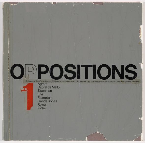
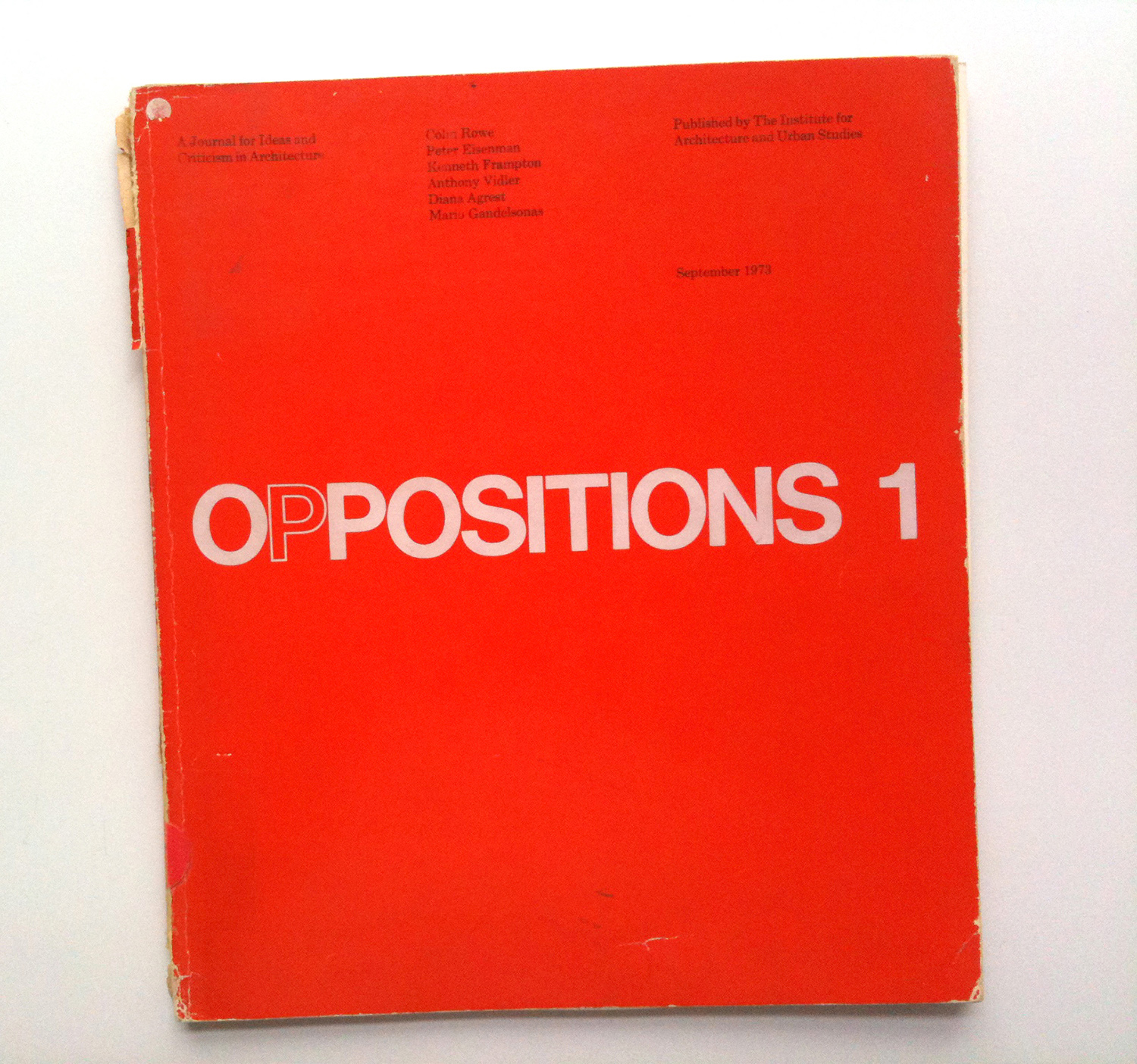
The Oppositions journal was formed as a small publication under the Institute for Architecture and Urban Studies[i] (IAUS) in New York [Fig. 1]. It produced twenty six issues from 1973 to 1984 when it was terminated as a result of the closing of the Institute itself, which, even though it started as an “anti-establishment institution of progressive architects, planners and thinkers”, turned into a “fashion able power base in New York” which “solicited mainstream patronage”.[ii] Its main significance in recent architectural history is seen in the successful introduction of European architectural theory to the United States. According to Joan Ockman[iii] in “Resurrecting the Avant-Garde: The History and Program of Oppositions”, American architectural theory of that time was not very conscious of “several major currents of contemporary European discourse”[iv], mainly the ideological, Marxist oriented Frankfurt school and the more linguistically oriented French structuralist school.
The journal was started at the initiative of Peter Eisenman. When arriving to Princeton, Eisenman had an ambition of starting a “Team 10 –like”[v] group in the United States. His primary ambition was based on the premise that true modernism never came to America, which is why he organized the Conference of Architects for the Study of Environment (CASE). CASE was intended to be the “latter-day CIAM on American Soil”[vi] and Oppositions was to be its publication. After several unsuccessful attempts[vii] he was finally able to start the magazine under the Institute for Architecture and Urban Studies in New York. The initial editorial team was comprised of Eisenman, Mario Gandelsonas and Kenneth Frampton. Frampton was the technical editor of Architectural Design, a “UK-based architectural journal first launched in 1930 as Architectural Design and Construction”[viii] and the only one in the initial group who had any knowledge or experience in publishing magazines. The editorial team was later joined by Anthony Vidler in Oppositions 6, Kurt Forster in Oppositions 12 and finally, Diana Agrest in Oppositions 26 (which was issued without Eisenman, Frampton and Forster).
The texts that were published in the first issue of the magazine were not originally intended for that purpose. Before the members of IAUS were able to start Oppositions, they had sent a package to the Architectural Design for an upcoming special issue.[ix] When the entire package was refused the team finally decided to start its own magazine and used this package for the first issue. Since they did not prepare other issues before publishing the first one, they decided to implement a system of promotional posters that would announce the forthcoming issues. The name, Oppositions, was proposed to Peter Eisenman by Mario Gandelsonas. It was intended to have multiple meanings. Eisenman’s original idea for the design of the magazine was intended to illustrate this clearly. With the outlined first letter “P” the title was to be read both as “positions”, “oppositions” and “zero positions” which was an intentional ambiguity. The reading of “zero positions” was the most important one since it could also be “intended to mean not no position or lack of position, but rather an intention to be new, start from scratch, from “degree zero”, a polemical nodding to Roland Barthes and typical of avant-garde magazines in the heyday of modernism: namely to return a stagnant architectural culture to its ABSs, to a pioneer and reformist role in cultural politics”.[x] Anthony Vidler explained in a later interview for the book Clip, Stamp, Fold[xi] that the initial idea of the magazine’s editors was not to develop a certain specific position, but rather to develop a series of positions that related to the current architectural discussion and debate. The idea was rather to critically asses the current architectural discourse and oppose it with a variety of different positions (depending of course on the editor or writer who was doing the critical assessment) than to propose a unison position, which was what the magazine then nurtured throughout the years to come. The need for these multiple standpoints and for the ambiguity within the name of the magazine itself can be explained by the state of architecture itself in the period of the 1970s. Today we refer to this period as postmodernism.
It is important to explain that postmodernism cannot be understood as a formal style, as its predecessor, modernism, was considered. In comparison with modernism, it does not have a unison set of thoughts and questions. The modern movement is specific because of the existence of a central problem, which does not exist in the postmodern period. What differentiates the postmodern period from modernism is the possibility of existence of multiple truths, theories and questions, where all are considered to be as relevant as the next one even though some of them may be even directly opposed to each other. By the end of modernism, architecture has turned into itself and has started to ignore all external inputs while other fields of study have started to increasingly intertwine. With the collapse of the modern movement, architecture also takes on this trend of looking at itself through the lenses of other philosophical and theoretical fields such as semiotics, communication theory, linguistics, etc… By doing this in the 1960s, a new architectural “field”, which we today know as architectural theory, is formed.
STRUCTURE AND DESIGN OF OPPOSITIONS
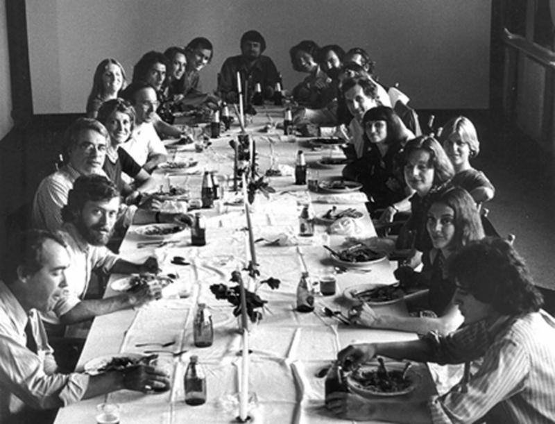
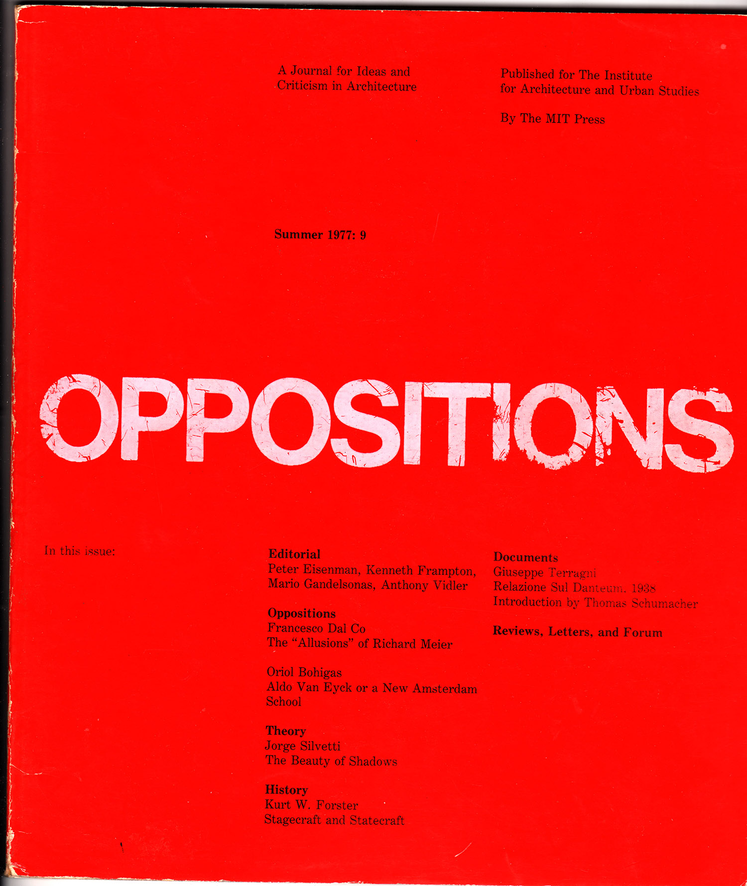
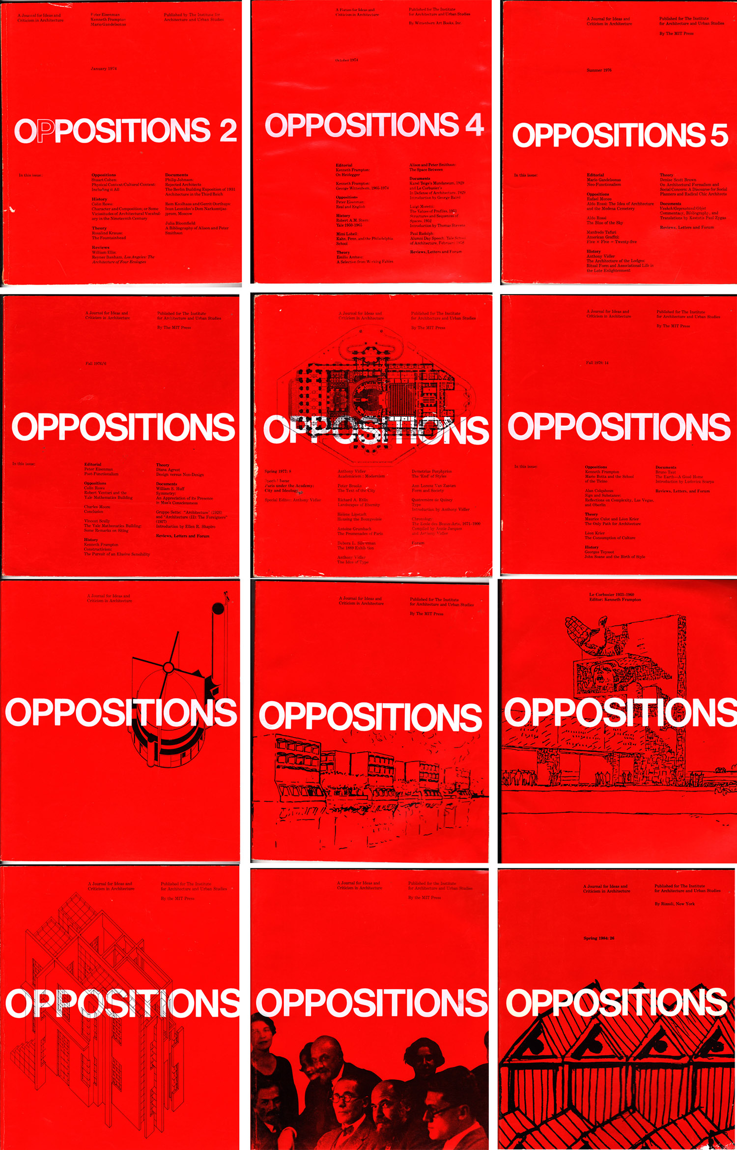
At this point in architectural history, every position was valid. And this is exactly what Oppositions was based upon. As seen already from the initial editorial statement[xii], Oppositions was intended to be a journal where the differences in architectural, political and socio-cultural views of the editors would be something that was accentuated rather than hidden. The structure of Oppositions is something that also supports the validity of multiple views. By dividing the magazine into categories named “Editorials”, “Oppositions”, “Theory”, “History”, “Documents” and periodical appearances of “Reviews”, “Letters” and “Forum” the editors seemingly provide a space for the discussion of architecture from multiple standpoints and through different methodical lenses. The “Editorials” segment started as a joint venture, which then turned into individual editorials starting from Oppositions 4. In Oppositions 7 the group reinstates the joint editorial only to dismiss it again in Oppositions 9. After that the “Editorial” segment appears sporadically. The “Forum” segment, even though it seems extremely relevant at first glance, since it is what the editors promoted as the basic goal of the magazine, was discontinued from the publication. It was a “report on a topic-oriented public event that was held at the Institute to mark the publication of each issue”[xiii] which later ended up being a segment of the magazine where photographs of glamorous, invitation-only events were published for no better reason than to portrait the sponsors, editors and members of the Institute enjoying cocktails through conversations about architecture.
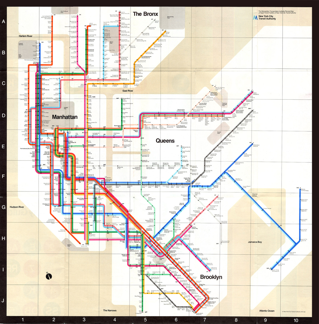
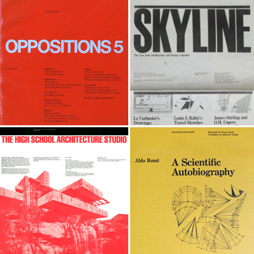
What was interesting about the Oppositions journal was how it was designed, published and promoted. This can be viewed both as a singular case or a comparison with other significant little magazines throughout architectural history, and through their relationship with mainstream architectural publications of those respective times. As mentioned before, the initial design for the cover of the Oppositions journal was attempted by Peter Eisenman himself [cover image] but his effort was soon replaced by the work of Massimo Vignelli.[xiv] Vignelli was trained as an architect in Italy and since the 1970s he had lived and worked as a designer in New York. At the time he started to be involved with the Oppositions and the IAUS he was already an established designer. He had just been commissioned to develop the new graphic system for the New York Subway [Fig. 3]. It can be concluded that his pro bono work for the Institute was not a result of a young designer trying to establish himself but that it was rather a fact of interest in the content of the journal itself that had drawn him to develop a design for Oppositions. Before Vignelli came to the Institute, all the graphic material was developed by the fellows and one could say that Vignelli’s arrival to the Institute gave them a much needed graphic identity, which is definitely an important aspect for an architectural institution that establishes itself by producing printed material of both theoretical and design substance. He designed for the Institute a complete graphic identity with design templates, grids and typefaces that were used throughout the functioning of the IAUS [Fig. 4].
Vignelli was brought to Oppositions through Richard Meier and Julia Bloomfield (both members of the Institute for Architecture and Urban Studies) and has worked for the Institute for free until its demise in 1984. In order to thank him for the work that he put into the Institute and because of the significance of Vignelli’s work, the Institute organized an exhibition for him in 1975 and had made him a trustee in charge of all the graphic production of the Institute in 1979. By starting to work on the Oppositions, Vignelli automatically dismissed Eisenman’s original idea for the grey cover of the magazine (was there pun intended here in relation to the previous split of the “whites” and the “greys” I do not know[xv]) and insisted on a “Swiss orange/red” color. Even though he encountered some opposition from Eisenman, he was able to convince the editorial team that the bright color will serve a purpose of “standing out in the bookshelf, and when there will be twenty of these [issues of the Oppositions journal] they will all be there and everybody will know it is Oppositions.”[xvi] [Fig. 5]
EUROPEAN INFLUENCES
Vignelli was not the only Italian involved in the magazine. One of the reasons why Oppositions is considered a very significant architectural journal is precisely for the connection it had with Italian architects and architectural theorists, critics and historians. The members of the IAUS were in constant contact and collaboration with the members of the Italian Tendenza group and the members of the Venice school, which is how they were able to successfully introduce European architecture and theoretical discourse into the United States. Some of the more famous Italians introduced this way were of course, Aldo Rossi and Manfredo Tafuri, whose text were both published within the Oppositions journal itself. The members of Tendenza group and, later, the Venice school were part of the neo-rationalist movement which followed the famous Italian rationalist movement which involved one of Eisenman’s and Vidler’s inspirational figures Giuseppe Terragni[xvii] (who was also published in the “Documents” segment of Oppositions 9 in 1977 [Fig. 6] ).
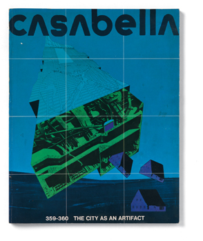
Oppositions journal was profoundly influenced by other little magazines of previous architectural eras. Even though Eisenman is keen to state the enormous influence of the Italian Casabella[xviii] magazine [Fig. 7, Fig. 8], especially from its 1930s period when it was edited by Giuseppe Pagano, a more interesting comparison is definitely the one with L’Esprit Nouveau [Fig. 9]. The two magazines (Oppositions and L’Esprit Nouveau) had a similar maximum circulation of about 2000 copies at the peak level of the magazine. Surprisingly, L’Esprit Nouveau at one point even reached a circulation of 3000 copies which is a quite impressive number for a magazine of that time. L’Esprit Nouveau was a little magazine published in Paris between the years of 1920 and 1925. The editors of the magazine were Le Corbusier, Amedee Ozenfant, a French painter, and Paul Dermee, a Dadaist. Dermee was eliminated from the magazine by its fourth issue due to differences of opinion.[xix]
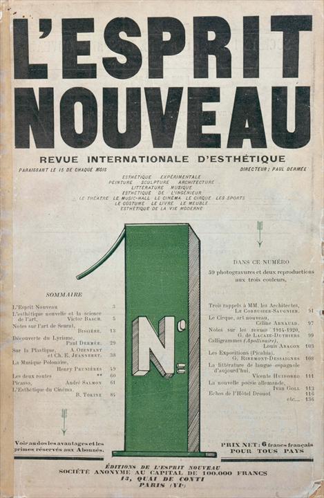
Another connection between the Oppositions and L’Esprit Nouveau is found if we look at the way both magazines were promoted and how their structure was utterly different from other magazines of their respective eras. Both magazines used specific tricks in order to attract both readers and sponsors and to ensure the longevity of the influence of the magazine. Both also looked very different from the rest of their contemporary magazines and their content was also very different.
L’ESPRIT NOUVEU AND OPPOSITIONS
If we look at L’Esprit Nouveau we can understand that Le Corbusier definitely had a good understanding of advertising techniques. He used catalogue images of industrial objects and presented them in his magazine. Sometimes, he presented these objects together with images or drawings of his built or unbuilt projects, giving himself in this way an architectural legitimacy. What he accomplished by connecting advertising images with his thoughts and works was to unconsciously implement his architectural thoughts onto the readers of the magazine who would then, every time they see a specific advertisement, automatically think of the work of Le Corbusier. This resulted in clients coming to him to solicit him for projects when he still lacked an impressive compilation of built work. In an era where mass media was just developing and a new way of communicating a message developed with it, we can conclude that Le Corbusier successfully used these new mechanisms in his favour. In the words of Beatriz Colomina in “L’Esprit Nouveau: Architecture and Publicite”, Le Corbusier presented his arguments in L’Esprit Nouveau by juxtaposing image and text. But,
“unlike the representational use of imagery in traditional books, Le Corbusier’s arguments are to be understood in terms of never resolved collisions of these two elements. In his unconventional manner of conceiving a book, one can see the influence of advertising techniques. As in advertising, the strongest effect is achieved through the impact of visual material.”[xx]
In a way, Le Corbusier was using a method newly formed outside the realm of architecture, to promote his architectural thought and architectural projects. He “borrows the rhetoric and techniques of persuasion of modern advertising for his own rhetorical arguments and manipulates actual advertisements to incorporate his own vision, thus blurring the limits between text and publicity.”[xxi] Using advertisements was also a way of soliciting sponsors for the magazine, but this was not done in a traditional way. He first published the magazine with the advertisements incorporated with it and then shipped the issue to the specific producer asking in return a financial compensation for the advertisement. This of course worked in some instances and in some not. By using these methods, L’Esprit Nouveau differentiated itself from the other publications of that time. The magazine was a true record of that specific moment in time, and Oppositions took it as an example to try and do the same.
Oppositions also had a very specific way of self-advertising and making sure that it remained important in the future of architectural theory and discourse. One way of doing this was by printing posters of forthcoming issues [Fig. 10]. The posters contained the titles and subjects for articles that would appear in the next issue of Oppositions, but most of these articles never appeared in the magazine. Another thing that the editors of Oppositions did was to “predate the articles. In other words, if an article was scheduled to come out in October 1973 we would say that it was in the spring of 1972 issue so that we would get first billing in all of the history books.”[xxii] The journal also tried to differentiate itself from its contemporaries. As Peter Versteeg said, “it was not the novelty of the images that seduced this student into acquiring his first copy of Oppositions. No, what attracted him, intrigued him, was a different curiosity, a conviction that reading it would open up a new way of thinking about architecture.”[xxiii] With its vast columns of dense architectural texts and a scarce number of drawings an images accompanied only by a simple caption, Oppositions is already visually very different from most of the architectural magazines that we know of (if we do not include in this a number of dense scholarly journals). It lacked the shiny, colourful images and skilfully positioned architectural photographs that try to sell the image of the autonomy and importance of architecture [Fig. 11]. Even the design of the cover was boldly different. And because of that it still stands out from the rest of the architectural magazines.
RELEVANCE OF OPPOSITIONS
By sticking to a constant, recognizable design system [Fig. 12] and focusing only on the theoretical and architectural message that is being conveyed through the words in the journal itself, it strips itself from the unimportant embellishments that only deter the reader from the important content and it does it in a way that is in essence very close to the initial postulates of the modern movement. This was also a revolutionary statement of that time. The minimalist design of the cover which presents the texts and their authors on the front cover of the magazine (up until issue 15) it convincingly tells the story of the importance of the actual content. At a time when consumerism and spectacle were in full bloom, to produce a magazine where even the names of the sponsors are hidden within the folds of the covers was unprecedented. With a very modernist approach to the graphic design and presentation of the magazine, it was able to convey a multiplicity of different theoretical standpoints and broaden the architectural discourse. Through using design methods that focus the reader on the actual textual content of the magazine itself instead of just the visually attractive images, Oppositions was able to successfully produce the first truly theoretical magazine in the United States. This was evident to the editors of Oppositions almost at the beginning of its publishing life, when Mario Gandelsonas stated for the French Architecture Mouvement Continuite review shortly after the second issue:
“The entry of Oppositions on the American scene of architectural review must be seen as an attempt to “oppose” another conception of architectural publishing and in this way to question the contemporary situation; this situation may be defined schematically by the two opposite types of review that share the market: the “established” architectural review (i.e. Progressive Architecture), and the non-commercial review, which appears irregularly from the architecture schools (i.e. Perspecta)… The first concerns itself with defining and marketing the latest current trends in built work, the second with the passive diffusion of texts and projects according to such criteria as “quality” and “distinctiveness”.”[xxiv]
By purposefully not elaborating in detail all the specific contributors, authors and seminal architectural, theoretical, critical and historical texts that were published in Oppositions during its 10 year life, and by shifting the focus on the little architectural magazine itself as a tool of dissemination of architectural knowledge and a successful method of introducing and merging two completely different architectural backgrounds, the European and the American, we can evaluate the true successfulness of the Oppositions journal. By using its fragmented structure to introduce a variety of architectural, theoretical, historical and critical positions, it remains to be knowledge recourse for architects’ even decades after it’s extinguishing. Maybe it is precisely because of its multiplicity of views, standpoints, subjects, its unwillingness to conform to any specific architectural current, and by indirectly promoting the possibility of personal growth as architects and as a field (which is visible directly in the magazine through the changes in viewpoints and influences of the editors throughout the years) Oppositions is still able to reach, puzzle and inspire the thoughts of young generations of architects to come.
REFERENCES
[i] The Institute for Architecture and Urban Studies was a non-academic institution in New York , founded by Peter Eisenman in 1969 which lasted until 1985. During its short lived existence, the Institute was a platform for architects like Peter Eisenman, Mario Gandelsonas, Rem Koolhas, Frank Ghery, Diana Agrest, Rafael Moneo, Bernard Tschumi, Michael Graves, Kenneth Frampton and others. “From the mid-1970s the Institute embraced pedagogical and cultural function with its educational programs, public events and various publications, and a built nationwide reputation as the center of debate.” (Forster, Kim. The Institute for Architecture and Urban Studies, New York (1967-1958). Doctoral dissertation, ETH Zurich. Zurich, 2011)
[ii] Joan Ockman. “Resurrecting the Avant – Garde: The History and Program of Oppositions”, EAV – Ensignement architecture ville 10. Versailles. Ecole d’architecture Versailles, 2004/2005. 31-44
[iii] Joan Ockman is a professor of architecture at Columbia University in New York. Between 1976 and 1982 she was involved both with the Institute for Architecture and Urban Studies in New York as well as with the publication of Oppositions and other IAUS publication. She was also a correspondent for the Italian magazine Casabella (EAV 2004/2005; www.theberlage.nl)
[iv] Ibid. 2.
[v] Peter Eisenman. Interview by Colomina, Beatriz and Grau, Urtzi in New York, October 2006. Clip, Stamp, Fold; The Radical Architecture of Little Magazines 1960x to 197x. Princeton University. M+M Books, Media and Modernity Program, Actar. 2011
[vi] Ibid. 2.
[vii] The first publications were to be called CASE and Re:Form, both of which were never published.
[viii] Architectural Design. Wikipedia
[ix] Peter Eisenman, Mario Gandelsonas, Kenneth Frampton and Anthony Vidler. “New York – Barcelona – Milan: Peter Eisenman, Mario Gandelsonas, Kenneth Frampton and Anthony Vidler discuss Oppositions, Lotus, and Arquitecturas Bis”. Clip, Stamp, Fold; The Radical Architecture of Little Magazines 1960x to 197x. Princeton University. M+M Books, Media and Modernity Program, Actar. 2011
[x] Ibid. 2.
[xi] Beatriz Colomina, Craig Buckley, Urtzi Grau. Clip, Stamp, Fold; The Radical Architecture of Little Magazines 1960x to 197x. Princeton University. M+M Books, Media and Modernity Program, Actar. 2011
[xii] The initial editorial statement from Oppositions 1 (Eisenman, Frampton and Gandelsonas. September 1973) stated among other that: “Oppositions is an attempt to establish a new arena for architectural discourse in which a consistent effort will be made to discuss and develop specific notions about the nature of architecture and design in relation to the man-made world. It is our joint belief that truly creative work depends upon such an extension of consciousness.[…] In all this, no attempt will be made to establish a single editorial line. The Institute will maintain its independence while we, as editors, will simply attempt to maintain the discourse at a high level and to concentrate on issues which in one way or another must necessarily affect the future status of architecture and design. Naturally our respective concerns as individuals for formal, socio-cultural and political discourse will make themselves felt in our joint editing of Opposition. The oppositions alluded to in the title will first and foremost begin at home…”
[xiii] Ibid. 2.
[xiv] Massimo Vignelli (1931-2014) was an Italian architect and designer. After having studied architecture at the Politecnio di Milano he moved to the United Stated from 1957 to 1960 when he returned to Italy to open his design office. After five years in Milano, he returns to the United States where he co-founds Unimark International (first multinational design corporation). In 1971 he opens Vignelli Associates with his wife Lella in New York where he did some of his most influential design work as the New York City Subway map, the corporate identity for American Airlines, Stendig Callendar and, of course, the design for the Oppositions journal as well as all other graphics for the IAUS. (Forster, Kim. “Massimo Vignelli: Oppositions, Skyline and the Institute”, Places, September 2010; Editor’s letter and interview with Massimo Vignelli. Munari, Nicola-Matteo. www.designculture.it. 2013)
[xv] The Five (The New York Five / The Five Architects) was an architectural group comprised of Peter Eisenman, Michael Graves, Charles Gwathmey, John Hejduk and Richard Meyer. The group was also known as “The Whites” because they “stood for purism, for the Platonic ideal of abstraction”. Even though, architecturally, all of them had significantly different styles, they were held together by “a determination to reject the social concerns of the 1960s in favour of inquiry into pure aesthetics.” The “Greys”, on the other hand, was a Yale based group of architects, formed around Robert A.M. Stern. They were oriented more towards the theoretical views of Robert Venturi who questioned that their work expressed the reality of shades of grey, not the false perfection of pure white.” The group consisted of Stern, Charles Moore, Jaquelin T. Robertson, Allen Greenberg and Romaldo Giurgola. (Goldberg, Paul. “Architecture View; A Remembrance of Visions Pure and Elegant”. The New York Times. New York, January 1993)
[xvi] Ibid. 5.
[xvii] Kenneth Frampton. “Place, Production and Scenography: International Theory and Practice Since 1962”. Modern Architecture: A Critical History; 4th edition. London. Thames and Hudson, 2007
[xviii] Ibid. 11
[xix] Beatriz Colomina. “L’Esprit Nouveau: Architecture and Publicite”. Architectureproduction. New York: Princeton Architectural Press, 1988. (Architecture Theory Since 1968. Edited by Michael K. Hays. MIT Press, 2000)
[xx] Ibid. 19.
[xxi] Ibid. 19.
[xxii] Ibid. 9.
[xxiii] Peter Versteeg. “Oppositions. A School Journal?” EAV – Ensignement architecture ville 10. Versailles. Ecole d’architecture Versailles, 2004/2005. 44-50
[xxiv] Ibid. 2.